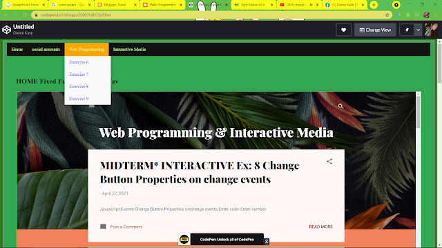
FINALS* WEB PROG. Ex 11: Multimedia


HTML

<!DOCTYPE html>
<html>
<head>
<meta name="viewport" content="width=device-width, initial-scale=1">
<title> Linking Videos </title>
<link rel="stylesheet" href="Exercise 011 iFrame video CSS codes.css">
</head>

<body>

<div class="navbar">
<a href="#home">Home</a>
<a href="https://www.blogger.com/profile/10763411263729214682" target="Unhappy">About</a>
<a href="https://https://www.facebook.com/darenkate.ojascastro.9/" target="Unhappy">Contacts</a>
</div>

<div id="row1" class="row">
<div class="column1">

</div>
<div id="row1" class="row">
<div class="column2">
<h1 id="home"> HOME </h1> <h3> Welcome! come and join me to watch cute animals.  </h3>
<hr>
<h1> Funny Animals that Will 100% Cheer You Up 😂🥰 </h1>
<p> This video will autoplay but is muted </p>
<iframe width="560" height="315" src="https://www.youtube.com/embed/RXtASMSzXIU" title="YouTube video player" frameborder="0" allow="accelerometer; autoplay; clipboard-write; encrypted-media; gyroscope; picture-in-picture" allowfullscreen></iframe>
<hr>
<h1> Funniest Animals 🐧 - Best Of The 2020 Funny Animal Videos 😁 - Cutest Animals Ever </h1>
<p> This video is looped </p>
<iframe width="560" height="315" src="https://www.youtube.com/embed/YcXWD7m8q24" title="YouTube video player" frameborder="0" allow="accelerometer; autoplay; clipboard-write; encrypted-media; gyroscope; picture-in-picture" allowfullscreen></iframe>
<hr>
<h1> Funny Animal Tik Toks to Brighten Up your Day 😂 🥰
 </h1>
<p> This video does not display controls </p>
<iframe width="560" height="315" src="https://www.youtube.com/embed/7TpZXma43WE" title="YouTube video player" frameborder="0" allow="accelerometer; autoplay; clipboard-write; encrypted-media; gyroscope; picture-in-picture" allowfullscreen></iframe>
</div>
<div id="row1" class="row">
<div class="column3">

</div>
<footer id="footer" style="background-color: #d8abff;padding: 20px;">
<p style="margin-left: 65px;color:#000000;"> Daren Kate Ojascastro Portfolio: </p>
<a href="https://webbbprog.blogspot.com/" style= "margin-left:70px;color: #000000;"> Ojascastro Portfolio! </a> <br>

</footer>
</body>
</html>

CSS

* {

box-sizing: border-box;

}


body, html {

height: 100%;

min-height: 100vh;

margin: 0;

position: relative;

font-family: "Times New Roman";

background-repeat: no-repeat;

padding-bottom: 30px;

}


iframe:focus {

outline: none;

}


iframe[seamless] {

display: block;

}


.navbar {

overflow: hidden;

background-color: #d8abff;

}


.navbar a {

float: left;

font-size: 16px;

color: black;

text-align: center;

padding: 14px 16px;

text-decoration: none;

}


.dropdown {

float: left;

overflow: hidden;

}


.dropdown .dropbtn {

font-size: 16px;  

border: none;

outline: none;

color: white;

padding: 14px 16px;

background-color: inherit;

font-family: inherit;

margin: 0;

}


.navbar a:hover, .dropdown:hover .dropbtn {

background-color: #ff546b;

}


.dropdown-content {

display: none;

position: absolute;

background-color: #ffa38c;

min-width: 160px;

box-shadow: 0px 8px 16px 0px rgba(0,0,0,0.2);

z-index: 1;

}


.dropdown-content a {

float: none;

color: black;

padding: 12px 16px;

text-decoration: none;

display: block;

text-align: left;

}


.dropdown-content a:hover {

background-color: #ffcba6;

}


.dropdown:hover .dropdown-content {

display: block;

}


.row::after {

content: "";

clear: both;

display: table;

}


[class*="col-"] {

float: left;

padding: 15px;

}


.column1 {

float: left;

width: 2%;

background-color: #ffffff;

height: 10px;

}


.column2 {

border: 10px solid #ffffff;

float: left;

width: 96%;

padding-left: 25px;

padding-right: 25px;

}


.column3 {

float: right;

width: 2%;

background-color: #ffffff;

height: 10px;

}


[class*="col-"] {

width: 100%;

}


@media only screen and (min-width: 600px) {

.col-s-1 {width: 8.33%;}

.col-s-2 {width: 16.66%;}

.col-s-3 {width: 25%;}

.col-s-4 {width: 33.33%;}

.col-s-5 {width: 41.66%;}

.col-s-6 {width: 50%;}

.col-s-7 {width: 58.33%;}

.col-s-8 {width: 66.66%;}

.col-s-9 {width: 75%;}

.col-s-10 {width: 83.33%;}

.col-s-11 {width: 91.66%;}

.col-s-12 {width: 100%;}

}


@media only screen and (min-width: 768px) {

.col-1 {width: 8.33%;}

.col-2 {width: 16.66%;}

.col-3 {width: 25%;}

.col-4 {width: 33.33%;}

.col-5 {width: 41.66%;}

.col-6 {width: 50%;}

.col-7 {width: 58.33%;}

.col-8 {width: 66.66%;}

.col-9 {width: 75%;}

.col-10 {width: 83.33%;}

.col-11 {width: 91.66%;}

.col-12 {width: 100%;}

}


#footer {

position: relative;

height: 150px;

margin-top: -100px;

clear: both;

}

Comments

Popular posts from this blog

FINAL* INTERACTIVE EX 11: Chat Box

WEB PROGRAMMING Ex 5: Header & body